Memo From Frank
On this month in 1888, George Eastman patented the “box” camera, and the photograph became a mainstream way to record family history for millions of Americans. The old expression “to hit the bullseye you have to aim for the middle” means that to really tap into high levels of demand, you need to have a product that appeals to the average person, as they outnumber both ends of the spectrum. The same is true for billboards. If you can offer a billboard on a major road at a reasonable rental amount, you can appeal to a huge number of advertisers, while mega-expensive signs – despite terrific visibility and traffic count numbers – only appeal to a tiny fraction of the advertiser market. I learned this the hard way when I purchased two signs at the entrance to DFW Airport that rented for $5,000 per month per side. While I had no problem renting them in the good times, when those few advertisers who could afford them were still feeling prosperous, in recessions the entire advertiser universe evaporated and my $5,000 rent fell to $2,000 pretty quickly. The lesson learned is that owning signs that rent for reasonable amounts that any advertiser could afford – from the local Dairy Queen to the local motel – is a far safer place to be in than depending on large, national advertisers that you can count on two hands.
The Most Powerful Words In Billboards: “Exit Now”
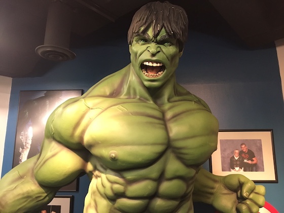
There are no sweeter words to close a deal with an advertiser than to tell them that the sign can say “exit now”. Those two words are the most powerful statement in all of outdoor advertising. They take an average sign and advertisement and add an unbelievable amount of horsepower to it – kind of like strapping a jet engine on a soap box derby car. Why is “exit now” so powerful?
Maximizes the “point of purchase” attribute
One of the strongest selling points for renting a billboard is that it is more than just an advertisement: it has the ability to transcend that and become “point of purchase”. When you place an ad in a magazine, there’s no way that you can time it so that the reader sees the ad at the exact same time that they pass by your business or product and say “I just saw an ad for this, so I think I’m going to buy it”. Only a billboard has this trait. It’s called “point of purchase” and it’s very valuable to advertisers.
Erases complexities of exit lines
When the advertiser is at the first exit after the billboard, the description of how to get to the advertiser’s business is simple: “exit now”. However, many billboards fail to offer this uniquely simple feature, and the directions can virtually become a short story. I’ve seen exit descriptions like “exit #9 then left at the light, then 2 blocks to Union Ave. and turn right”. How can a customer remember such a description when they’re traveling at 55 mph and can only see the sign for 5 seconds? They can’t.
Affirmed by Harvard Business School
Someone who graduated from Harvard Business School once told me that their professor said this about the value of a billboard: “they are extremely important if they can contain the these two words: exit now”. I cannot confirm this as I never attended Harvard Business School, but I can believe it. I’ve found many advertisers who shared this opinion, even though they never went to college. That’s why you should always focus on those advertisers at the next two exits down from your sign, so they can put “exit now” or “next exit” on their signs (affirmed by the exit number). I have found that the longest renewing advertisers on billboards – and I’m talking decades of renewals – are those that are located at the exit and can say “exit now”.
Conclusion
“Exit now” are two very important words. Use this to your advantage. Focus on advertisers that meet this profile, and enthusiastically educate them on this fact. As long as there is even one advertiser at the next exit, you should never have a vacant sign.
Billboard Home Study Course
![]() How to Find a Billboard Location
How to Find a Billboard Location
![]() How to Buy a Billboard
How to Buy a Billboard
![]() How to Build a Billboard
How to Build a Billboard
![]() How to Operate a Billboard
How to Operate a Billboard
![]() How to Rent Ad Space on a Billboard
How to Rent Ad Space on a Billboard
![]() How to Sell a Billboard
How to Sell a Billboard
Get Your Copy Now!
Which Sign Stands Out More?
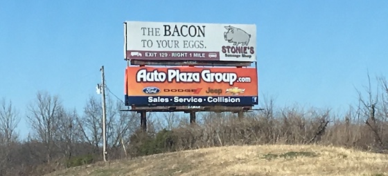
I’m pretty sure you guessed the advertisement on the bottom. So what makes it so more effective? It’s because of a simple law of color theory, discovered long ago, that the eye naturally searches out the opposite color to the one that it sees. In other words, in a sea of green, the eye searches out red, which is the exact color opposite of red. The lower sign is using an orange background, because the advertiser knows that the eye will search out this color when it sees green trees and a blue sky, because it is the polar opposite. The top sign has no effectiveness because it is an earth tone coloration, which blends into the environment. Earth tones may be fine in interior decoration, they make for lousy billboard color choices!
Safety First Makes Complete Sense
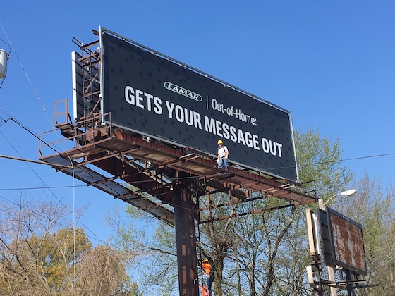
Working on billboards is extremely dangerous work. You may not be aware of it, but there have been a large number of fatalities and serious injuries from falls from signs. And the sad part is that most of these accidents could have been avoided with proper safety equipment. When it comes to working on object that are often several stories off the ground, safety should always come first.
Learn the laws
Every billboard owner should initially learn what the laws are for billboards regarding safety equipment. Most billboard fabricators can tell you what they know, but it’s always smart to call the federal agency known as OSHA (Occupational Safety Hazard Agency) and get the details. While the laws will make complete sense right off the bat, how to achieve the desired effects may not be as obvious.
Make sure your sign has the required safety equipment
Once you have established what the rules are, it is your job to make sure that your signs are 100% compliant. Ignorance is not an excuse if someone gets injured. Most safety systems involve horizontal cables on each catwalk, and vertical cables on each ladder. The worker wears a harness that attaches to these cables and eliminates their ability to fall from the sign. You’ll learn to watch for these items and to get a sense if a sign has the appropriate rigging.
Make sure that anyone who climbs your sign has insurance coverage
Even with the advent of safety equipment, accidents can still happen. As a result, any person that climbs up your billboard must have valid insurance and in the correct amount of coverage. Ask your insurance agent to review the insurance on any new vendor and confirm that it is correct. After somebody is injured it’s too late to ask. If your insurance carrier says the vendor’s insurance is not sufficient, then you cannot engage them to work on your sign, no matter how attractive the price is. Saving $1,000 is great but is quickly offset by a lawsuit of $100,000 or more.
Don’t take safety mildly
If any vendor is seen on a billboard you own without wearing their harness, you need to fire him or her immediately. You cannot compromise on safety. Accidents can happen in seconds, and being lax will often embroil you in major litigation that can greatly damage your company. I remember a fatal accident that occurred about 30 years ago in Dallas. Two workers were playing a game to see who could get down a ladder faster. To accomplish that, they took off their harness. The winner plummeting 100 feet off a building and was killed. This accident had nothing to do with an actual work-related injury, but simply complete disregard for common logic. But that’s often the case with people who work on signs.
And don’t forget about what can happen under the sign
It’s also important to note that people on signs can do damage beyond just to themselves. The worst insurance claim I ever had was the result of two workmen having a competition to see how far they could throw a metal object off the sign. The winner destroyed a fully restored 1957 Chevy convertible. Another reason that insurance is absolutely mandatory before anyone climbs up that ladder.
Conclusion
Signs are very tall. People don’t do well when they fall long distances. The moral is that you must make sure that you are following all OSHA mandated guidelines, and that every person on your sign has adequate insurance.
To Stack Or Not To Stack?
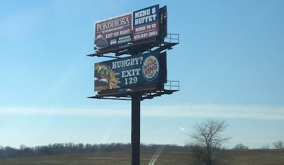
So the sign ordinance in the city or state you are building in offers you two options. One 672 sq. ft. billboard, or two 10’ x 30’ stacked signs – one on top of the other. Which is the smarter way to go? There are several ways to approach this question.
Will it create extra revenue
Will the two 10’ x 30’ advertisements rent for more, when combined, than the larger single sign? For example if the single sign rents for $800 per month, and the two stacked signs rent for $400 a piece, then there’s no real financial advantage to building a stacked sign. If the single sign rents for $800 and the stacked signs for $550 each, then there may be merit in the concept.
Will it hedge future demand weakness
Even if the single sign rents for $800 per month, what happens if the nation goes into recession and all advertisers reduce their spending? It might be that it’s far easier to rent signs for $550 each, and that would point to the stacked sign option. Although one option, in a recession, would be to divide the larger sign in half with a right and left advertising space, the stacked sign is often easier to sell advertisers on, as they have their own 100% ad space.
Is the end product where you want to be 10 years from now?
Often you build a sign and then the market grows up around it. So the billboard you build today will often be a totally different sign a decade from now, when the market is ten times larger and the ad rent is much more valuable. Since the larger sign is more attractive to a big, national billboard company, it will command a much higher price when you go to sell the structure. However, if the location of the stacked sign is relatively remote and unlikely to see a lot of development in the next decade, then their may be nothing to consider in this regard.
Acknowledging the weaknesses
Stacked signs have always had one major weakness: the fact that the upper sign casts a shadow on the lower in the daytime, and the reverse at night (when the lights create a shadow going up). You cannot change these problems, you can only embrace them and convince the advertiser that the benefits outweigh the drawbacks. If you don’t feel comfortable with the product, then don’t build a stacked sign.
Conclusion
Stacked signs definitely have a place in the arsenal of billboard structures. But they are not always the correct choice. Evaluate your options and decide accordingly.
The Economics Of Wooden Billboards
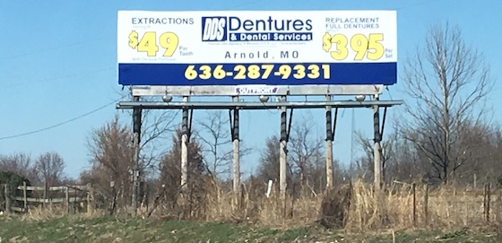
Viewed strictly as return on investment, the wooden billboard is at the top of the pack when compared to all other types of billboard structures. While steel monopoles can produce more revenue, they also have higher operating expenses and a much higher capital cost to build. Making money with wooden billboards has long been a popular option. So what do the numbers look like?
Revenue
A wooden sign, assuming a small town location on a two-lane highway, will often rent for around $2,000 per year per face. If you build a two-sided sign, then the revenue would be around $4,000. And because the amount is small, this amount is often paid up front by the advertiser, in one lump sum. That makes collections a breeze and gives you immediate gratification.
Expenses
Most wooden billboards are not lighted, so there is no electricity expense. Additionally, the advertiser typically provides the vinyl to install, or pays for you to print it. So your only cost line items are 1) land rent (typically 15% to 20% of revenue), vinyl installation (typically around $150 per side), repair and maintenance (around $150 per year), insurance (around $100 per year) and property tax (sometimes not even assessed, but other times maybe $50 per year). There is also the possibility of a permit renewal cost which might be around $50 per year. So the total expenses are around – in this case -- $1,000 per year.
Net Income
When you subtract the operating costs of $1,000 from the gross revenue of $4,000, the result is a $3,000 net income. That means that, after the debt for building the sign is paid off, you could count on putting $3,000 per year in your pocket from the sign’s operation. This number is more impressive when you scale it up. If you own just 10 signs, that number is $30,000 per year, which is twice as much as the average social security payment in the U.S. At just 35 signs, it’s $104,000 per year – more than the average attorney makes in the U.S. At 100 signs, it’s $300,000 per year, which puts you in the top 1% on income earners in the U.S.
Cost to Construct
This is extremely variable depending on where you build it and the exact size you build, but you can often build a 12’ x 24’ wooden sign on telephone poles for around $4,000 total. Larger signs may carry larger price tags, but they would also rent for significantly more money. One great reason to use a 12’ x 24’ size is that, as the market matures, the sign is adaptable to be converted into a standard 30 sheet advertisement by a national sign company, giving you greater exit options.
Return on Investment
At a $3,000 annual income, that’s a very impressive 75% return on investment. Compare that to putting $4,000 in the bank in a CD at 1%. It would take that CD 75 years to earn as much as just one year of your billboard. In fact, it’s hard to find any investment in the U.S. that can match or surpass a wooden billboard.
Conclusion
Wooden billboards may not be the prettiest form of sign on the market, but they are among the highest yielding. You can build an excellent retirement – or day job – out of these wooden wonders.
Signs Don’t Have To Be LED To Be Interactive
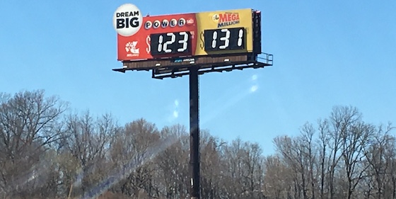
Many people believe that only LED signs have the ability to get your attention with the type of movement and lighting that can grab the eye and make you look. There have been many other options to accomplish this over the years, and they cost a fraction of what LED does. So what are they?
Signs that change price
You see this frequently on gas station and truck stop billboards. The sign has a section that changes to reflect the cost per gallon. These are extremely effective, and the only reason you do not see them on every sign of their type is the cost, as well as the difficulty in changing the numbers (you used to have to climb the sign to flip the numbers, but now the better units are changed from the bottom using digital circuitry).
Signs that have solaray
Also known as “billboard sequins”, these are small discs that are cut at different angles and are held on the sign using stips that allow the discs to move with the wind. These discs reflect sunlight, and the net effect is similar to a jumpsuit worn by Elvis Presley. Solaray is highly effective, but has lost popularity with the advent of vinyl technology, as you have to nail them on top of the vinyl and in to the sign panels.
Signs that move
While these type of billboards have pretty much vanished over time due to their high cost and operational difficulty, they are making a comeback in some markets. Basically, you build an “extension” – like a human arm – and you attach it to the sign with an electric motor that makes it slowly move back and forth. In this fashion, the arm can wave to the passing motorists, or point towards an exit. These are landmark signs when utilized effectively, but make sure they meet your state’s sign ordinance, as some do not allow the sign to have moving pieces.
Signs that have unusual lighting
I once created a very effective billboard for a client that showed a line of cars parked with their headlights on. The “headlights” were just circular cans with light bulbs in the middle, and a piece of plastic over the front that was spray-painted to create a glow. There are many other uses for this concept, from the flowing tip of a cigarette to a lighted arrow to supplement the “exit now” verbage on the sign.
Signs that have portions that change every month
This is a very effective item that many people don’t realize: you can set aside a portion of any billboard to have a changing message to keep the sign interactive. I once had a billboard with the Canton Flea Market that showed the date of the next sale. I changed it out every month so the passing motorists could be informed. I had another sign that told of the musical groups playing that month at their club. You can even make this section out of movie marque “channel” and put hang-on letters like a movie theater does.
Conclusion
Advertisers love interactive signs. They grab attention and are well received. Don’t think that you can only accomplish this with LED. There are many less expensive options to grab your customers’ attention at a fraction of the cost.
The Market Report
Prices Are Delayed By At Least 15 Minutes
