Memo From Frank
Thanksgiving is an interesting holiday. It began as an acknowledgement of the annual harvest, and has blossomed into the national day of giving thanks for all of our blessings. And those in the billboard industry have a lot to be thankful for in 2019. As the internet continues to change the world of marketing – and wreak destruction on magazines, newspapers and television properties – the old-fashioned nature of billboards protects it from new technologies. Additionally, the amount of traffic on America’s roads continues to grow, yielding higher traffic counts and higher billboard rates. Finally, the financial returns on billboards continue to be spectacular.
We would also like to take this opportunity to thank all of our readers and friends in the industry. We have a huge amount of fun putting this newsletter together each month and hope that you enjoy it, as well.
Have a Happy Thanksgiving!
Tips on Building Your Collection of Billboards for Maximum Efficiency

Most American museums have strict criteria on the paintings they acquire. And, in a similar vein, smart billboard portfolio owners have careful selection rules when building their collection of signs for maximum efficiency and profitability. So how does that work?
Geography for driving efficiency
The typical billboard owner sees their territory as being a 4 to 5 hour drive from their home. That’s still a pretty large circle (it’s 10 hours from one edge to the other, and that’s about 700 miles) so that’s not very efficient. However, smart billboard owners like to “bunch” their signs into smaller geographic areas. One trick is to take that giant territorial circle and break it into four quadrants, and then focus on the quadrant that you think has the most promise.
Bunching units for sales efficiency
Having signs located in tighter areas also offers efficiency in renting the ad space. If you have a number of signs in the same city, for example, your list of potential advertisers is the same for all signs, meaning you have much less work in learning the market. But if you want maximum sales efficiency, even better is to group signs on one single highway or road, so you become the “king” of that stretch of highway and your sales pitch is highly efficient with “we have a number of signs on Interstate 70, what exit are you trying to direct traffic to” mantra.
Building units with standardized sizes
Back in the early 1900s two bicycle repairmen – Foster and Kleiser – realized that standardizing the new invention of “billboards” would be productive before they started building them, and then set forth to scientifically study what those sizes should be. All the sizes we use today (14’ x 48’, 12’ x 24’, etc.) came from that experiment. What’s important is that you should always build these standardized units. When you build a sign dimension that is not part of the norm, you will not be able to use the designs that have been approved for advertising, and that may preclude you from renting ads to national accounts that don’t customize. It also makes it hard to remember just how large each sign you own actually is.
Lights that are interchangeable
Standardizing light fixtures is also smart from an efficiency standpoint. If you use the same type of fixtures on all signs, then you know exactly what parts you need to fix them. You know the exact bulb, the exact ballast, and you no longer have to memorize each system and then see if the electrician even has that part. There’s nothing more frustrating than to have the electrician drive all the way out to your sign to replace the light bulb – all on your dollar – only to find he does not have the bulb because you told him the wrong facts.
Conclusion
Just like a collector focuses on just one finite item, smart billboard investors tend to try and build signs with a sole focus on maximum efficiency, which includes tight geographic placement, standardized sizes and consistent parts.
An Idea on Making Money From Vacant Storefronts

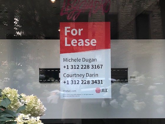
It is estimated that as much as 20% of all retail space will be vacant in the U.S. over the next five years – and that’s a lot of vacant windows! Is there a business model developing from all this high-traffic vacancy? Potentially. Here are some thoughts on that.
A growing opportunity
Retail vacancy is an incredible problem in the U.S. – estimates are that 20% of all retail space will be vacant over the next ten years. You can’t walk through a mall or city street without seeing vacant retail space everywhere. Most of this retail space has great traffic and visibility – the perfect combination for outdoor advertising.
An interesting win/win
Vacant retail space is depressing for everyone – both the building owner as well as the viewing audience. Most building owners try to mask this emptiness with some type of graphic, but it simply screams “empty space” and makes no money at all. If, instead, you were to use this vacant storefront space for advertising purposes, it would be aesthetically pleasing, informative for the passerby, and could generate income for the building owner.
Simple installation
Of course, with vinyl technology, putting an advertisement in a vacant storefront is extremely simple. “Sticky” vinyl can be placed on either the inside or outside of the windows, and can also be easily removed when the space is rented again. The cost to produce such a vinyl display is less than a dollar per square foot plus installation – a very affordable price.
But there may be potential permitting issues
On retail space inside a shopping mall, there are typically no permits needed since such a sign is exempt from the Highway Beautification Act as well as most city ordinances. But if the vacant storefront is seen from a city street, then there may be an issue with the city sign ordinance. But the situation is extremely complicated because nobody who ever wrote the sign ordinance anticipated using vacant retail space as the location for a billboard. In some cases it may come down to the old rule “do you ask permission or forgiveness?” That decision is up to you.
Conclusion
In a world in which advertisements are frequently installed on virtually anything, there’s no question that there may be an opportunity to place ads on vacant storefronts. Watch for these potential advertising possibilities.
The Ultimate Billboard Boot Camp
![]() How to Find a Billboard Location
How to Find a Billboard Location
![]() How to Buy a Billboard
How to Buy a Billboard
![]() How to Build a Billboard
How to Build a Billboard
![]() How to Operate a Billboard
How to Operate a Billboard
![]() How to Rent Ad Space on a Billboard
How to Rent Ad Space on a Billboard
![]() How to Sell a Billboard
How to Sell a Billboard
Get Your Copy Now!
How to Get What You Want From City Hall

Many cities don’t allow billboards. However, there is still a way to build billboards in these places – and it’s through something called a “variance”. This allows you to get an exemption from the city’s requirements. So how do you get a “variance” from city hall?
Don’t apply until you know you have the votes
Decisions at city hall don’t happen during the meeting, they happen before the meeting ever begins. Because of this, you should never file to appear before the city council or zoning board before you already know you have the votes. Talk to each council member and the mayor and see if they support or hate your concept. Ask the “haters” what it would take for them to vote in favor. See if you can strike a deal with each one. If you have the majority vote before you go to the meeting, you will have it when the vote comes up.
Sell the sizzle
Never show photos of billboards when discussing your plan with city hall – show them renderings instead (or photo-synthesized photos that make the sign look better than it actually will). You can pay an architect to draw such a rendering (or find someone on a website such as Fiverr.com) and then use this same drawing over and over.
Show how the greater community benefits
If you want to win at city hall, you need to show benefits to the greater community. The best arguments in favor of billboards are:
- Creates more traffic to exit the highway and visit the downtown area, which boosts all sales.
- Creates more awareness for the town and creates a source of pride.
- Creates more property tax revenue.
If you can come up with some additional arguments, throw them on the pile.
Be patient and work the system
Some of the best city hall variances take years to obtain. You have to be patient and work the system to get what you want. You cannot push city hall around. They have their own methodology and system and you have two options: 1) to work with them diligently or 2) get frustrated and give up. Only #1 makes any money.
The landowner can be an important asset
Sometimes the best way to get a variance passed is to enlist the aid of the property owner who will be getting the income from the sign. This individual – typically a pillar of society in the town – can also go to the city council and have an impact on their decision. Unlike you, they know everybody.
Conclusion
Getting a valuable variance to build a billboard is an art form. And it works nothing like the average person thinks. These tips will get your started.
Billboard Color Theory

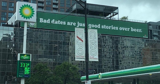
The photo above shows an extremely poor color choice by the advertiser, who selected a green sign next to a green BP gas station. What are some of the basics of billboard color theory to prevent this type of thing from happening?
A simple axiom: the eye seeks the color that is the opposite of what it sees
It makes complete sense: your seek out the color that is rare and unusual. In a sea of green your eye seeks out the opposite of green, which is red. Test this theory yourself. Stare at a color on a sheet of paper for 30 seconds and then stare at a sheet a white paper. What do you see? The opposite of the color you were staring at.
Use the opposite of the color of the sign’s setting
Based on this simple theory, you need to use colors on billboards that are the opposite of the common color of the setting. For example, if you have a billboard that is set against a grove of trees, then it should contain the color red for maximum effect. Since green is the common color of nature, that’s why so many major companies have red signs (McDonalds, Wendy’s, Chik-fil-A, etc.). It’s not just random luck. In the case of the sign photographed, it should have been obvious that green was the one color that should never have been used.
Conclusion
The selection of color on a billboard is common sense. Unfortunately some advertisers and billboard companies fail to use it all the time.
