Memo From Frank
I recently completed a 2,000 mile road trip across Colorado, Nebraska, Kansas, Iowa and Missouri. I personally much prefer driving to flying, as I really enjoy seeing unusual sights and seeing the scenery between destinations, not just flying over them at 10,000 feet. One of the things that entertains me during these drives is looking at the billboards and noting the regional differences between them. After a while, you can actually tell what part of the nation you are in based on the billboards you see. For example, if the sign has no lights, it’s probably in Colorado, New Mexico or Arizona. If the sign is of any shape other than rectangle, it’s probably in the Ozarks of Missouri. Start noticing the billboards as you drive around America and see if you don’t spot some of these territorial differences.
The Limitations Of Mobile Billboards

Mobile billboards have a large number of limitations, which is the key reason that they have never really caught on as a good advertising value. Since you may be competing for ad dollars with mobile billboards at some point, it’s important to know their faults so you can knock them out of the consideration.
Very limited audience equals poor traffic numbers
One of the biggest problems with mobile billboards are that, even though you can claim that they are going down the highway with a big traffic count, the truth is that only the cars directly behind or on either side of the truck actually see the ads. Even if the highway has 80,000 cars per day, only about 20 people actually see the ad. It’s basically just a big con on the part of the mobile billboard owner trying to rent the ad space.
No point of purchase
The strongest part of a billboard is that it is the only advertising source that offers “point of purchase” by giving exit directions right when the customer is approaching the business. Saying “Motel 6 Next Exit” is a thousand times more important than just advertising “Motel 6 Stay With Us”. The mobile billboard has no “exit now” possibilities, so it ruins the strong point of the billboard sales pitch.
Small ad size
Billboards are huge. Mobile billboards are not. The ad size is around 100 sq. ft. compared to the average billboard at 672 sq. ft. So what has to give? Most of the ad message. Mobile billboards don’t give the advertiser much space for their sales pitch. And that weakens the effectiveness enormously.
Trouble reading the ad
The human eye can only read letter sizes at certain distances. This is known as “resolution”. Too far away, and you only see lettering but can’t read it. So the only people who can actually read the mobile ad are those that are the correct distance. Another reason that this type of advertising is so ineffectual – the number of people behind or beside the truck is further limited by the exact distance they are from the ad message.
Conclusion
Mobile billboards are nowhere near as strong a value for the advertiser as traditional billboards are. And now you know why. Don’t let a mobile billboard salesman steal your customer.
The Power Of “Bunching”

Do you ever see the same ads on several signs in a row, or the same advertiser? This is a type of marketing technique called “bunching” – and it’s highly effective.
What is it?
“Bunching” is the technique of running sequential ads. The pioneering advertiser for this concept is Burma-Shave. They would run ads, one after the other, which told a story in different verses on each sign. Since then, many billboard advertisers have adopted the same concept in certain applications. For example, the University of Missouri has seven billboards in a row on Interstate 70, to promote the university’s football program, the final sign having a three-dimensional goal post on it.
Why do advertisers do it?
“Bunching” causes the viewer to have much greater retention of the ad. Why is that? The reason is that the mind is intrigued by seeing the same thing twice. It’s not something that you see every day and, as a result, you’re going to be shocked by it. And that shock translates to higher retention.
Should my advertisers consider it?
It’s certainly not for every application, but if your client has the financial capability – and you have sequential vacant billboards -- then it’s definitely something to consider. The best uses of “bunching” typically involve having two strong sales points, with each billboard building on those points. For example, if you have an advertiser that has great lunch and dinner specials, then one billboard could advertiser the lunch special, and one the dinner special.
Conclusion
“Bunching” is a highly effective billboard technique. Keep it in mind when you hit the right advertiser and have two or more vacant signs next to each other.
Billboard Home Study Course
![]() How to Find a Billboard Location
How to Find a Billboard Location
![]() How to Buy a Billboard
How to Buy a Billboard
![]() How to Build a Billboard
How to Build a Billboard
![]() How to Operate a Billboard
How to Operate a Billboard
![]() How to Rent Ad Space on a Billboard
How to Rent Ad Space on a Billboard
![]() How to Sell a Billboard
How to Sell a Billboard
Get Your Copy Now!
Why Are Billboards Rectangular?
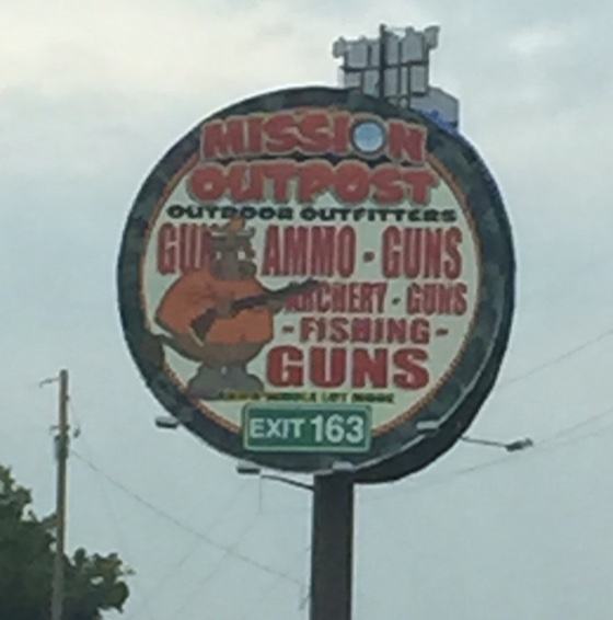
We are all accustomed to seeing billboards that are rectangular in shape. But why is that so? Why can’t billboards be in other shapes? Well, there’s a bunch of reasons why.
Foster & Kleiser’s testing results
The billboard industry began with the inventive thinking of two bicycle shop owners named Foster & Kleiser. They had an idea that billboards could be an important byproduct of that new invention called the car. So they began testing different ideas on how to reach the horseless carriage with ads. And the results of their test was the creation of many of the billboard shapes and sizes that are still in use. We don’t what shapes they tested, but the winner was the rectangle. And that’s what the industry adopted.
The requirements for reading words
Maybe one reason that Foster and Kleiser came up with the rectangular billboard is the simple fact that we read letters and words from left to right and not up and down. So we need billboards to be rectangular so that you can quickly and easily read the words. No other shape maximizes the ability to digest the ad verbage.
Ease of installation and service
In the early days, signs were hand-painted, and you had to hang a scaffold over the top of the sign, yielding a level platform to walk on. That necessitated a rectangle. Today, you wrap the sign in vinyl – but it still requires a straight surface to work from, as well as catwalks to walk on to hang the vinyl over the billboard face. In addition, you need a flat bottom surface to hang the light fixtures from, which again points to a rectangle.
The punishment for being a pioneer
If, despite these facts, you still think you want to build a round or triangle-shaped sign, then be advised that you are going to ruin the liquidity of your billboard investment. When you go to sell your billboard years from now, it needs to be a standardized shape and size to attract a national company to write you a check. America is filled with pioneering shapes and sizes that nobody wants, and these are wastes of a perfectly good permit and steel.
Conclusion
It’s always fun to see different shapes of billboards on the road. But don’t build any of these.
Fun On The Road At The Jessie James Museum
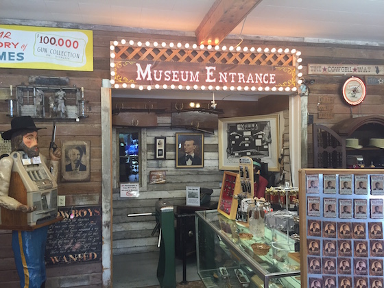
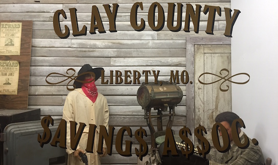
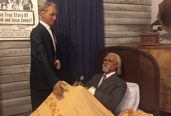
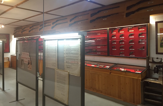
I have driven past the Jessie James Museum on Interstate 44 in Missouri for years, but never made it inside – it’s always closed when I drive by. But this time I lucked out. This is the type of experience that makes driving around in America so much fun. And when I look for new billboard locations, I have always found finding these type of oddball institutions one of the best parts of the job. Meramec Caverns opened in 1933 as a tourist attraction. Meramec Caverns is a huge billboard advertiser in the Midwest, having erected hundreds of billboards in the 1950s and 1960s, prior to the Highway Beautification Act (when you could build signs anywhere you wanted to). The Jessie James Museum opened its doors sometime in the 1960s, as an additional draw for tourists driving by. The basic premise of the museum is that Jessie James did not die as a result of being shot by Robert Ford, but instead died of old age down in Texas, and used the Robert Ford ruse to take the heat off his pursuit by the authorities. The museum is incredibly small and about half of it is a collection of guns from the 19th century to current times. A classic tourist trap, yet a bunch of fun if you’re bored and in the area. This is the type of stuff that really keeps me interested when I’m out driving around.
New Billboards For Sale On OutdoorBillboard.com
The Market Report
Prices Are Delayed By At Least 15 Minutes
