Memo From Frank
In September of 1609, the island of Manhattan was discovered by navigator Henry Hudson. Since that time, it has grown into the most populated city in the U.S. That’s a great example of wanting to build and buy billboards in markets that are primed for rapid growth, but in cases where you are years ahead of the curve. I was recently in east Texas, and drove by some billboards I owned in Forney. When I built the signs, the biggest employer was a bunch of ramshackle antique stores, and the ground rent was super cheap. Today, the commercial frontage is filled with Lowe’s and Walmart, and literally every restaurant franchise you can name. Those type of situations can drive ad rents from $500 per month to $5,000. And that’s exactly the type of opportunities you should be looking for. They say that it’s better to be lucky than smart, but it’s even better to be so smart that you don’t have to rely on luck. Watch for situations where you can build or buy billboards ahead of the pack, and you’ll always look like a genius in the end.
Why Aren’t Billboards Square, Round Or Some Other Configuration?

As anyone who drives America’s highways is probably aware, billboards are traditionally shaped like rectangles. But why is that? Believe it or not, there is good reason that the average billboard is shaped like a shoe box and not a bowling ball. And it’s been that way for over a century.
A function of plywood sizes
All billboards since 1920 have been built out of plywood sheets, that come in a 4’ x 8’ or 10’ standard size. So billboards became functions of that framework. Signs became traditionally 12’ high (1 sheet vertical and one horizontal = 8’ plus 4’) and 32’ wide (8’ end to end three times). If you look at any billboard (other than the most modern that have plastic or metal panels that were built specifically for billboards) from the back or the front, once the vinyl is removed, you will see that the face of all signs is good old American plywood, and that has something to do with the sizes that are used.
Tradition
Another reason that billboards are rectangular is that’s what Foster & Kleiser decided on back in the early 1900s. Foster & Kleiser were two bicycle repairmen and retailers that also moonlighted installing early “posters” on walls of buildings – which were the billboards for pedestrians at a time when cars did not exist. They saw big opportunity in the advent of the automobile, and did significant testing to see what sizes would work best for advertising to these early motorists. After their research, they developed the 14’ x 48, 12’ x 32’ and other sizes that are still in use today. If they had chosen triangular billboards instead, probably all billboards today would be triangular
Standardization
Another reason that all billboards are basically the same shape and size has to do with standardization – the basic concept that things are more efficient when everything can use the same parts. By having one set of basic billboard shapes and sizes, it makes the industry not have to stockpile different sizes of billboard panels, or customize each piece of vinyl to meet that particular sign’s dimensions.
To enhance basic reading from left to right
The reason that vertical billboards are not as effective as rectangles is the simple fact that all Americans read from left to right, not from top to bottom. If you put five words in a line, it’s quick and easy to read. Stack them one on top of the other, and it is very difficult or impossible. Since most billboards strive never to have more than 5 words in a line, the rectangular sign is perfect for this application.
To allow for 50% copy and 50% pictorial
In the early days of signs – and even today – the sales message is a combination of words and graphics. By having signs be horizontal in configuration, you have the ability to have ample room for both words and pictures – about half and half. Look at the average advertisement and you’ll see what I mean.
Lighting issues
Rectangular signs are easy to light. You simply need one light per so many feet of width. Vertical signs, or round signs, are hard o illuminate, as you have to put light fixtures on both top and bottom, and the top lights cast a shadow in the daytime. In addition, it’s much simpler to affix an extremely heavy light fixture to the metal catwalks on the bottom of the sign than trying to adhere them to the top of the sign face, which has no structural support.
Ad installation issues
With modern vinyls, it’s essential to have a flat upper surface to roll the vinyl out on before draping it over the sign. Circular or triangle signs would be near to impossible to cover in vinyl. Before the invention of vinyl, the signs were hand-painted, which required a flat surface to hang the scaffolding from.
Conclusion
Horizontal billboard shapes are the norm in the U.S. – and with good reasons. From ease of installation to visibility, this is the best shape for signs. That’s been the truth for the past 100 years, and I’m sure it will be true 100 years into the future.
Billboard Home Study Course
![]() How to Find a Billboard Location
How to Find a Billboard Location
![]() How to Buy a Billboard
How to Buy a Billboard
![]() How to Build a Billboard
How to Build a Billboard
![]() How to Operate a Billboard
How to Operate a Billboard
![]() How to Rent Ad Space on a Billboard
How to Rent Ad Space on a Billboard
![]() How to Sell a Billboard
How to Sell a Billboard
Get Your Copy Now!
Billboards As Hip Fashion Statement

Billboards have been a fixture of American culture for decades, and here’s a billboard as part of a major fashion ad campaign. It’s a little known fact that, back in the 1990s, billboards actually became fashion. Back then, some billboard companies donated their used vinyls to a company that made them into purses. They would take the vinyl advertisement and cut it into sections and then sew those into fashion handbags that still had that tiny portion of the ad on them.
How Many Words Should Your Billboard Ad Include?

So much to say and so little time to say it. That’s the dilemma of many advertisers. They want to write a book about their business and place it on the sign, but the line must be drawn on how many words the sign can have on it before it loses its effectiveness. So how many words should that be?
The standard response: 7
Many people in the billboard industry say that a sign should not have more than 7 words on it – that any more will diminish the ability to read the ad. As a result, the advertiser struggles to think about what exactly those 7 words should be. So how many words does the sign end up having? Typically 7.
A better response: as few as possible
The better way to approach this is to say “how few words can we use to get the point across?” If you can deliver the ad message in 5 words instead of 7, that means that the viewer can read that message faster and longer, and that the words can be in larger type. Sometimes you can replace words with pictures. For example, McDonald’s will show the breakfast sandwich and then just put $1 next to it, and the audience will know that it means that the food item is $1. The ad would be much less powerful if it said “Sausage McMuffin Only $1”. See if you can get the message across visually and not verbally.
A definite no-no: more than 10
We’ve all seen those terrible billboards that look like an encyclopedia – literally so many words that could not read any of them. If the advertiser wants to put their life story on something, put it on a newspaper ad in which the viewer can read it as long as they want. But the average billboard can only be seen for 5 seconds and that is a game-changer as far as the message the advertiser can get across. You are better off being honest with the advertiser when there are too many words, as the sign is sure to be a failure and then they won’t want to pay your invoice.
Conclusion
Good billboard advertisements all share one characteristic: very few words. And the few that they have are large and bold. Focus on keeping words to a minimum to end up with a successful ad that the advertiser will be happy to run forever.
Hiding Billboard Poles Can Create New Locations: Some Ideas
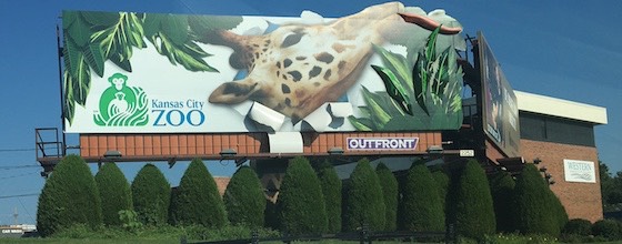
Sometimes, all that holds a property owner back from signing your ground lease is there concern over what the pole will look like. If there is a business on the land (or their own house), they may be concerned that the sign will look horrible and not blend in. So coming up with a plan to “hide” the sign – and convincing the land owner that you will succeed -- can be an important point of your lease negotiation.
Paint them to match
The first way to “disguise” a billboard pole is to paint it the same color as the surrounding building. Some billboard companies’ refuse to paint their signs a different color than the ones they use on every sign, like bright red or black. This is incredibly short-sighted as no advertiser has ever cared about the structure color, and pays the same rent whether the sign is black, brown, green, red or any other hue. If the building next to the sign is gray, then you should definitely paint the column gray to match.
Cover them in a matching material
Another option is to match the actual exterior material of any building on the property. I once covered a billboard column in brick to match the brick on the adjoining apartment complex. It was expensive, but it made the deal possible – it convinced the skittish apartment complex owner that the sign pole would not make his development look ugly. I then went to the neighbor and convinced him to build on his property by covering that column in stucco.
Hide them behind landscaping
In the old days – and even these days – a common technique has been to “hide” the sign column behind shrubbery. If you plan on doing this, make sure to only plant shrubs that do not require much water, as you will never want to go out and water things. In some climates, this is simply impossible. If you cannot find a hardy native shrub that can live on rain alone, then don’t even think about this option.
Conclusion
Disguising or hiding billboard poles is a valuable action step in convincing some property owners to sign your lease. Consider the options and be ready to counter any concerns.
Iconic Movie Scenes Of Billboards
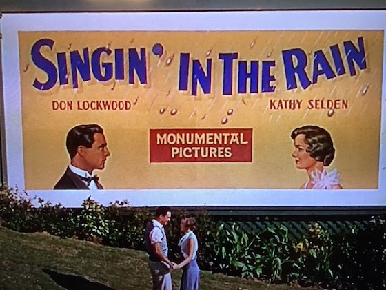
Billboards have been featured in many Hollywood films, but in some movies, the sign is a star. One of the best examples is the billboard at the end of 19__’s “Singing in the Rain”. It’s literally the final scene, with Gene Kelley and Debbie Reynolds standing in front of it. Another movie that had a celebrity sign in it was Steve Martin’s 19__ “The L.A. Story”. In this film, an LED billboard tells the main character what to do, and apparently has its own magical powers. While signs are standard props in many films, in some productions they actually become an active cast member.
Similarities And Differences From Billboards Around The World
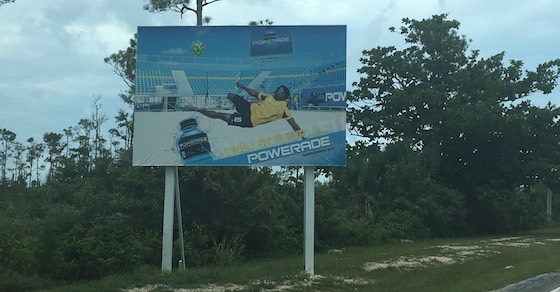
I have never built a billboard outside the U.S., but I’ve seen plenty of them, and they look very different from the U.S. variety. So what makes billboards overseas appear so unlike their American counterparts?
Steel vs. no steel
The above photo is of a billboard in the Bahamas. But you see this type of structure in many other countries, such as Africa. It’s all wood. In fact all of the billboards you will find in some countries are made of lumber. The reason is that steel in these countries is very expensive, and there may be limitations on dependable fabricators to build them.
Built by machine vs. built by hand
I have talked to billboard operators in Mexico, and many of them build the signs in the complete absence of construction equipment. They have learned how to augur the holes, raise the poles, and erect the entire sign without the use of a crane, instead using ropes and pulleys. They have improvised these systems due to the high cost or absence of the ability to rent the necessary machinery.
Permanent vs. temporary
In Canada, there is a huge percentage of wooden signs instead of steel as the result of permit laws. In the U.S., the sign company has the power, as the sign permit is “owned” by the billboard operator and, as laws change over time, the sign becomes grandfathered and the sign owner and land owner are stuck with each other forever. In Canada, on the other hand, the permit belongs to the land owner, so when the lease comes up for renewal, the property owner can get multiple bids. In addition, in Canada, the ground lease length is shorter than the U.S. As a result, sign owners don’t want to risk investing in giant steel signs when they might lose them down the road.
LED
In Asia, a huge proportion of billboards are LED. Whereas in the U.S. only a small subset of billboards has this expensive accessory, it’s extremely common in Asia. In fact, you can find LED on even small transit signs and the entire sides of buildings. While some of these LED systems have not been approved for use in the U.S., I believe that they can build and deliver LED billboards there for a huge reduction from U.S. pricing.
Conclusion
Billboards are different throughout the world. However, the basic business model is the same: rent ground space and then rent ad space, and keep the difference. Whether wood or steel, money is money.
The Reasons You Can’t Build Roof Mounts Anymore
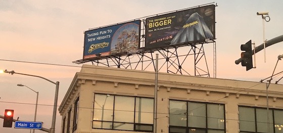
In the old days, many signs were built on the tops of roofs. These were called “roof-mounts” which means “mounted to the roof”. So why don’t you see more of those going up today? In most markets in the U.S., these type of signs are illegal to build today. You can operate them under the laws of grandfathering, but you can’t build any new ones. The reason is that modern city government is afraid that the sign’s weight might fall through the roof. They are also afraid that a burning building might result in the sign falling through and crushing the firefighters. Essentially, safety concerns brought an end to building new roof mounts. However, those still in existence are extremely valuable, as they typically have great visibility right in the heart of town.
How Ads Went Up In The Old Days
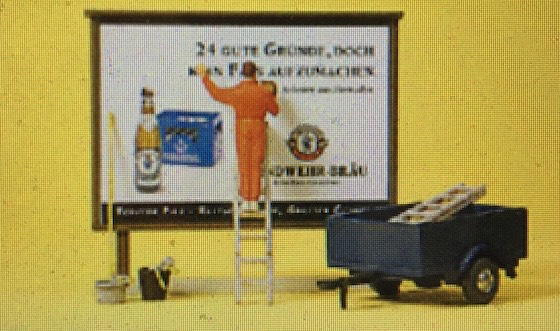
It may be hard for millennials to believe, but early signs were installed using a technique similar to wallpaper. The ads were printed on paper, and then “glued” to the ad service via a paste made from potatoes. It was a messy and painful business, as this paste was very acidic and would burn your skin. The installer would literally have to balance on a ladder, get the wallpaper in just the right position, and then glue it on there. It’s amazing that this could even be accomplished at all, but good billposters could complete this task in an incredibly short span of time.
The Market Report
Prices Are Delayed By At Least 15 Minutes
